Procrastination Prevention App - Chillist

Background
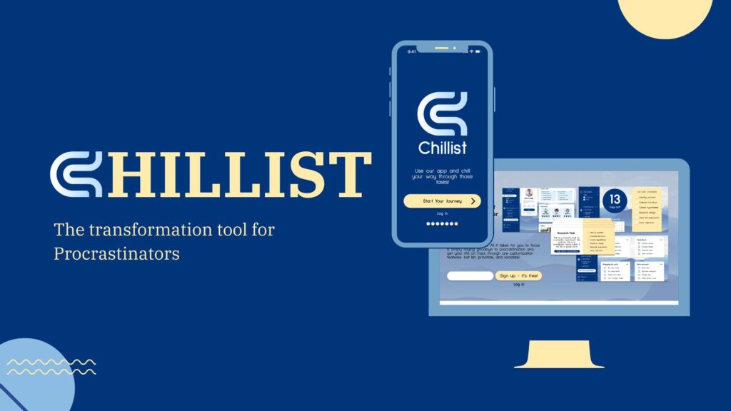
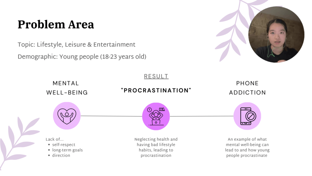
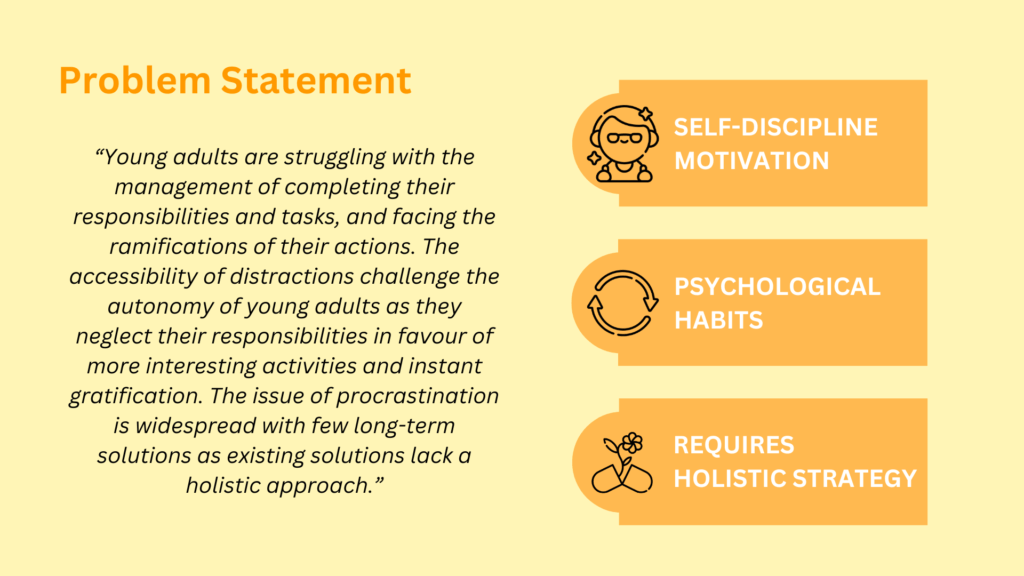
Procrastination is a complex problem affecting many young adults, and we aim to minimize its effects through long-term processes involving support and encouragement. Chillist is an app that focuses on reducing procrastination habits by introducing healthy habitual thinking through our simple features. We developed this app to engage users who identify themselves as procrastinators in various ways. The three primary features are community-based interaction, a customizable checklist with settings to prioritize tasks, and journal features to reflect on the user’s task progress. These features are backed up by our extensive research on users and the market.
Target Research
During the research stage, we used Miro board as our primary tool to store and share our data collection within the team. We used the tringualtion method for our research method by conducting qualitative and quantitative that contains observation and attidudinal data as well. The research method we used were expert and user interviews, surveys, online ethnography, and contextual observation. The collected data were further analyzed using affinity diagramming which is shown in the A1 section of our Miro board. Afte our analysis and synthesis of data, we presented its key findings through insights visually by using user personas, user journeys, and storyboards. The key findings can be viewed by clicking on the “Learn More” button on the left, which will lead you to our video presentation.
I believe the research stage is our strength in the project because of the extensive insights we identified from our research. This research stage made me acknowledge my strength as a researcher in the UX/UI field, which later turned into an enjoyment.
Product Development
This is the stage where we ideated different possible minimization method of procrastination (A2 Miro link). We used varities of ideation methods to brainstorm ideas. Later, we organized the created ideas into the design matrix, which had emphasized criterias such as socialization, simplicity, and promoting good habits, to mark the ideation. The final concept we went forward with had the highest mark which was to create an AI generative checklist app with a customizable priotization feature. Futhermore, the wireframes and mockup were created to visualize the final design concept and were tested with users and experts. This is the stage where we realized that AI generative checklist feautre is an interesting idea, but can be benefitial to make the app more simple because it may bring confusion and stress to procrastinators.
To learn more about the ideation and its details, the “Learn More” button is linked to the presentation slides.
Mid to High Fidelity Prototypes
This is the stage in the project where we worked on refining our chosen design concept and deveop them into series of prototypes. The process of the protoyping can be seen in the A3 section of the Miro page. To refine the protoypes, we conducted usability testing with users and experts using think aloud and heauristic evaluation accordingly. In the usability testing, we used the user interface created in Figma.
There were many obstacles faced during this stage because of the important feedbacks we recevied from the usability testings. This led to an extensive refinement for our last high fidelity prototype, which prompted us to changing the whole aesthetic of the user interface. This change in UI aesthetics can be veiwed further in the visual report by click on “Learn More” on the left.

